Slideshow tutorial
Step 1: Setup your slides
Create a div with the id of slider. Insert your images inside of this slider div. I am using different sized pictures to help demonstrate later steps. You will want to use all the same sized images.
HTML
<div id="slider">
<img src="images/lion.jpg">
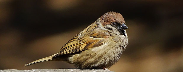
<img src="images/bird.jpg">
<img src="images/fish.jpg">
</div>
Step 2: Add style to your images
We will next apply some CSS to all the images, which will make them collapse on top of each other.
CSS
#slider img {
position:absolute; /*Collapses all images on top of each other*/
left:0; /*Sets the images to be on the far left side of the slider*/
}
Step 3: Add style to the whole slider div
We will need to add some CSS to the slider as a whole. The following code will set the height and width of the slider, remove any default margins, allow the slider to move relatively to the parent container, and hide the excess of any larger images.
CSS
#slider img {
position:absolute;
left:0;
}
#slider {
position: relative; /*Allows the slider to move relatively to the parent container*/
height:246px; /*Sets the height of the slider*/
width:618px; /*Sets the width of the slider*/
margin:0; /*Removes any default margins*/
overflow: hidden; /*Hides any excess*/
}
Step 4: Setup the animation
The following code sets up the animation name, easing, loops, and total duration. Notice that there is no animation at this point. The shorthand version of the code is also included below as a comment.
CSS
#slider img {
position:absolute;
left:0;
}
#slider {
position: relative;
height:246px;
width:618px;
margin:0;
overflow: hidden;
}
#slider img {
animation-name: sliderFadeInOut; /*This name will be used to call this animation*/
animation-timing-function: ease-in-out; /*This changes the speed of the animation*/
animation-iteration-count: infinite; /*This makes the animation loop forever*/
animation-duration: 7.5s; /*This is the total length of the animation (all slides)*/
/*The following code is how it would be written using the shorthand*/
/*animation: sliderFadeInOut 7.5s ease-in-out infinite;*/
}
Step 5: Setup the animation (keyframes)
Notice that the name of the keyframes is the same as the animation-name in the previous step. In this example each image will use the same animation. The image will start out visible at 0%, or 0 seconds, and continue to be visible until 27% of the animation has completed (27% of 7.5 seconds is 2.025 seconds). From 27% to 33% (2.025s to 2.475s) the image fades out. From 33% to 93% (2.475s to 6.975s) the image stays invisible. Finally from 93% to 100% (6.975s to 7.5s) the image fades back into being visible.
Notice that all the images flash at the same time when they are all using the same animation. The next step will fix this problem.
CSS
#slider img {
position:absolute;
left:0;
}
#slider {
position: relative;
height:246px;
width:618px;
margin:0;
overflow: hidden;
}
#slider img {
animation-name: sliderFadeInOut;
animation-timing-function: ease-in-out;
animation-iteration-count: infinite;
animation-duration: 7.5s;
}
@keyframes sliderFadeInOut {
0% {
opacity:1;
}
27% {
opacity:1;
}
33% {
opacity:0;
}
93% {
opacity:0;
}
100% {
opacity:1;
}
}
Step 6: Offset the animations to get the slider effect
To fix all of the images flashing at the same time we will need to add a delay to each of the images. This will allow each images animation to start at a different time. We will use the img:nth-of-type(#) selector to grab each image. The # sign should be replaced with the number of the image (for example the third image in your slider would be img:nth-of-type(3)). The animation-delay property is then added to each of the images with a value starting at 0s (on the last image), and then increasing by an offset of 2.5s. Notice now that the staggered animation creates a slideshow effect.
It is also interesting to notice that the slideshow goes backwards from the order placed in the slider div HTML. This is because the last image, by default, sits on top of the other images. All of the images start off visible so the slideshow must start with the image that is sitting on top.
CSS
#slider img {
position:absolute;
left:0;
}
#slider {
position: relative;
height:246px;
width:618px;
margin:0;
overflow: hidden;
}
#slider img {
animation-name: sliderFadeInOut;
animation-timing-function: ease-in-out;
animation-iteration-count: infinite;
animation-duration: 7.5s;
}
@keyframes sliderFadeInOut {
0% {
opacity:1;
}
27% {
opacity:1;
}
33% {
opacity:0;
}
93% {
opacity:0;
}
100% {
opacity:1;
}
}
#slider img:nth-of-type(1) {
animation-delay: 5s;
}
#slider img:nth-of-type(2) {
animation-delay: 2.5s;
}
#slider img:nth-of-type(3) {
animation-delay: 0s;
}
Step 7: How to calculate a custom slider
It will take some math to create a variation of this slideshow with your own number of images, speed of transitions, and image display lengths. There are some simple formulas that will allow you to calculate these numbers with ease.
HTML
CSS